Links to specific topics

(See also under "Labels" at the bottom-left area of this blog)
[ Welcome post ] [ Installation issues ] [ WarpPLS.com ] [ Posts with YouTube links ] [ Model-driven data analytics ] [ PLS-SEM email list ]
Showing posts with label Warp3 regression. Show all posts

Friday, March 26, 2010

Interpreting the U and S curves generated by WarpPLS


Linear relationships between pairs of latent variables, that is, those relationships best described by a line, are relatively easy to interpret. They suggest that an increase in one variable either leads to an increase (if the slope of the line is positive) or decrease (if the slope is negative) in the other variable.

Nonlinear relationships provide a much more nuanced view of the data, but at the same time are much more difficult to interpret correctly. The graph below (click on it to enlarge) shows an S curve that is fitted to the data represented by the dots (or small circles) plotted in a scattered way on the graph. The latent variables are “ECU”, the extent to which electronic communication media are used by a team charged with developing a new product; and “Effi”, the efficiency of the team.
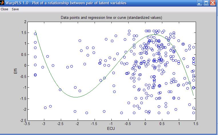

As you can see, the S curve is actually a combination of two U curves, one straight and the other inverted, connected at an inflection point. The inflection point is the point at the curve where the curvature, or second derivative of the S curve, changes direction. On the graph shown above, the inflection point is located at around minus 1 standard deviations from the "ECU" mean. That mean is at the zero mark on the horizontal axis.

Because an S curve is a combination of two U curves, we can interpret each U curve section separately. A straight U curve, like the one shown on the left side of the graph, before the inflection point, can be interpreted as follows.

The first half of the U curve goes from approximately minus 3.4 to minus 1.9 standard deviations from the mean, at which point the lowest team efficiency value is reached for the U curve. In that first half of the U curve, an increase in electronic communication media use leads to a decrease in team efficiency. After that first half, an increase in electronic communication media use leads to an increase in team efficiency.

One interpretation is that the first half of the U curve refers to novice users of electronic communication media. That is, novice users struggling to use more and more intensely communication media that they are not familiar with end up leading to efficiency losses for the team. At a certain point, around minus 1.9 standard deviations, that situation changes, and the teams start to really benefit from the use of electronic communication media, possibly because the second half of the U curve refers to users with more experience in using the media.

The interpretation of the second, inverted U curve, should be done in a similar fashion. As you can see, it is not easy to interpret nonlinear relationships. But the apparent simplicity of linear estimations of nonlinear relationships, which is usually what is done by other structural equation modeling software, is nothing but a mirage.

Tuesday, March 2, 2010

Geographically distributed collaborative SEM analysis using WarpPLS


I am currently conducting a geographically distributed collaborative SEM analysis using WarpPLS. The analysis involves a few people in different states of the USA, and two people outside the country. The collaborators are not only separated by large distances, but also operate in different time zones.

Yet, we have no problems collaborating. The collaboration is asynchronous – one person does some work one day, and shares it with the others, who review the work in the next few days and respond.

Since we all have WarpPLS installed on our computers, we exchange different versions of a WarpPLS project file (extension “.prj”) with the same dataset. This way we can do analyses in turns, and discuss the results on emails.

Each slightly different project file is saved with a different name – e.g., W3J_InfoOvld_2010_03_02.prj, W3B_InfoOvld_2010_03_02.prj, W2J_InfoOvld_2010_03_02.prj etc.

In the examples above, the first three letters indicate the SEM algorithm used (W3 = Warp3 PLS Regression; W2 = Warp2 PLS Regression), and the resampling method used (J = jackknifing; B = bootstrapping). The second part of the name describes the dataset, and the final part the date.

This is just one way of naming files. It works for our particular project, but more elaborate file names can be used in more complex collaborative SEM analyses.

This geographically distributed collaborative SEM analysis highlights one of the advantages of WarpPLS over other SEM software: all that is needed for the analysis is contained in one single project file.

Moreover, the project file will typically be only a few hundred kilobytes in size. In spite of its small size, the file includes the original data, and all of the results of the analysis.

One member of our team asked me how the project file can be so small. The reason is that all of the SEM analysis results are stored in a format that allows for their rendering every time they are viewed.

Plots of nonlinear relationships, for example, are not stored as bitmaps, but as equations that allow WarpPLS  to re-create those plots at the time of viewing.

Thursday, January 28, 2010

Viewing and changing settings in WarpPLS 1.0 and 2.0


The blog post below refers to version 1.0 - 2.0 of WarpPLS. See this YouTube video on how to view and change settings for version 3.0. For more recent versions, see the WarpPLS User Manual and YouTube videos available from warppls.com.

***

The view or change settings window (see figure below, click on it to enlarge) allows you to select an algorithm for the SEM analysis, select a resampling method, and select the number of resamples used, if the resampling method selected was bootstrapping. The analysis algorithms available are Warp3 PLS Regression, Warp2 PLS Regression, PLS Regression, and Robust Path Analysis.


Many relationships in nature, including relationships involving behavioral variables, are nonlinear and follow a pattern known as U-curve (or inverted U-curve). In this pattern a variable affects another in a way that leads to a maximum or minimum value, where the effect is either maximized or minimized, respectively. This type of relationship is also referred to as a J-curve pattern; a term that is more commonly used in economics and the health sciences.

The Warp2 PLS Regression algorithm tries to identify a U-curve relationship between latent variables, and, if that relationship exists, the algorithm transforms (or “warps”) the scores of the predictor latent variables so as to better reflect the U-curve relationship in the estimated path coefficients in the model. The Warp3 PLS Regression algorithm, the default algorithm used by the software, tries to identify a relationship defined by a function whose first derivative is a U-curve. This type of relationship follows a pattern that is more similar to an S-curve (or a somewhat distorted S-curve), and can be seen as a combination of two connected U-curves, one of which is inverted.

The PLS Regression algorithm does not perform any warping of relationships. It is essentially a standard PLS regression algorithm, whereby indicators’ weights, loadings and factor scores (a.k.a. latent variable scores) are calculated based on a least squares minimization sub-algorithm, after which path coefficients are estimated using a robust path analysis algorithm. A key criterion for the calculation of the weights, observed in virtually all PLS-based algorithms, is that the regression equation expressing the relationship between the indicators and the factor scores has an error term that equals zero. In other words, the factor scores are calculated as exact linear combinations of their indicators. PLS regression is the underlying weight calculation algorithm used in both Warp3 and Warp2 PLS Regression. The warping takes place during the estimation of path coefficients, and after the estimation of all weights and loadings in the model. The weights and loadings of a model with latent variables make up what is often referred to as outer model, whereas the path coefficients among latent variables make up what is often called the inner model.

Finally, the Robust Path Analysis algorithm is a simplified algorithm in which factor scores are calculated by averaging all of the indicators associated with a latent variable; that is, in this algorithm weights are not estimated through PLS regression. This algorithm is called “Robust” Path Analysis, because, as with most robust statistics methods, the P values are calculated through resampling. If all latent variables are measured with single indicators, the Robust Path Analysis and the PLS Regression algorithms will yield identical results.

One of two resampling methods may be selected: bootstrapping or jackknifing. Bootstrapping, the software’s default, is a resampling algorithm that creates a number of resamples (a number that can be selected by the user), by a method known as “resampling with replacement”. This means that each resample contains a random arrangement of the rows of the original dataset, where some rows may be repeated. (The commonly used analogy of a deck of cards being reshuffled, leading to many resample decks, is a good one, but not entirely correct because in bootstrapping the same card may appear more than once in each of the resample decks.) Jacknifing, on the other hand, creates a number of resamples that equals the original sample size, and each resample has one row removed. That is, the sample size of each resample is the original sample size minus 1. Thus, the choice of number of resamples has no effect on jackknifing, and is only relevant in the context of bootstrapping.