Linear relationships between pairs of latent variables, that is, those relationships best described by a line, are relatively easy to interpret. They suggest that an increase in one variable either leads to an increase (if the slope of the line is positive) or decrease (if the slope is negative) in the other variable.
Nonlinear relationships provide a much more nuanced view of the data, but at the same time are much more difficult to interpret correctly. The graph below (click on it to enlarge) shows an S curve that is fitted to the data represented by the dots (or small circles) plotted in a scattered way on the graph. The latent variables are “ECU”, the extent to which electronic communication media are used by a team charged with developing a new product; and “Effi”, the efficiency of the team.
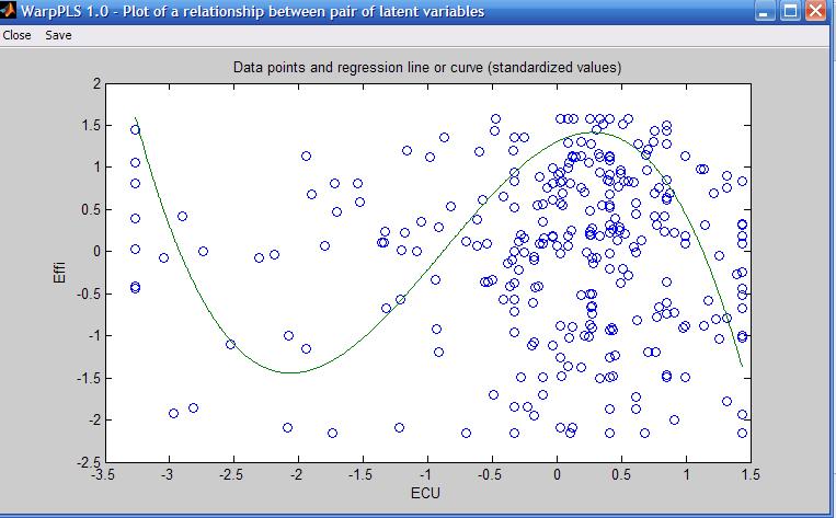
As you can see, the S curve is actually a combination of two U curves, one straight and the other inverted, connected at an inflection point. The inflection point is the point at the curve where the curvature, or second derivative of the S curve, changes direction. On the graph shown above, the inflection point is located at around minus 1 standard deviations from the "ECU" mean. That mean is at the zero mark on the horizontal axis.
Because an S curve is a combination of two U curves, we can interpret each U curve section separately. A straight U curve, like the one shown on the left side of the graph, before the inflection point, can be interpreted as follows.
The first half of the U curve goes from approximately minus 3.4 to minus 1.9 standard deviations from the mean, at which point the lowest team efficiency value is reached for the U curve. In that first half of the U curve, an increase in electronic communication media use leads to a decrease in team efficiency. After that first half, an increase in electronic communication media use leads to an increase in team efficiency.
One interpretation is that the first half of the U curve refers to novice users of electronic communication media. That is, novice users struggling to use more and more intensely communication media that they are not familiar with end up leading to efficiency losses for the team. At a certain point, around minus 1.9 standard deviations, that situation changes, and the teams start to really benefit from the use of electronic communication media, possibly because the second half of the U curve refers to users with more experience in using the media.
The interpretation of the second, inverted U curve, should be done in a similar fashion. As you can see, it is not easy to interpret nonlinear relationships. But the apparent simplicity of linear estimations of nonlinear relationships, which is usually what is done by other structural equation modeling software, is nothing but a mirage.

No comments:
Post a Comment